Monday, June 11, 2012
Friday, June 8, 2012
Wednesday, May 30, 2012
What Is Beauty?

When thinking about nature, the most beautiful thing I can think of is clouds. Beauty is serenity to me. The beauty comes from the mystery associated with them, and how no two clouds are ever the same.
Thursday, May 17, 2012
Commercial vs. Artistic

Many commercial photos try to sell happiness, and the photographers have established this kind of aura with the subject. I tried to achieve this same effect with my friend, by having her strike a pose and give me a huge smile. I think that this picture is a little artificial, but that is the way with most commercial photos.

This is my artistic photo, which is a more sincere representation of her personality. She's a really enthusiastic and crazy person, but also has very down-to-earth moments. She's very warm and loving, and has the kind of smile that cheers up everyone around her. I think that this photograph of her really represents her gentle side, which is a very different feel compared to the commercial photo.
Thursday, April 26, 2012
Portraits


This is one of my favorite photos because of the creepy feel it has to it. I think the simplicity of her clothing and skin makes it different, and the display of her hair is also very interesting. This is the kind of photo that inspires to to find out the story behind the photo, because it is so intriguing. I like the central framing of this photo because I think it emphasizes the simplicity and drama of it. For the lighting, I wanted it to be very natural lighting, with contrast. For the editing, I took down the exposure a little bit, and increased the contrast and saturation. I wanted the colors to be very basic and earthy, which is why I didn't change that aspect of the photo.
Thursday, April 12, 2012
Daguerreotype and Tilt Shift

A daguerrotype is a photo effect created in the 1800's that is made in the camera on a silvered copper plate. To get this effect on my photo, I first adjusted the contrast, brightness, and color balances. To finish the effect, I added the texture of waves at the ocean, which intensifies the effect. I love this photo because I think it's very simplistic and intriguing. I like the shapes of it, and also love how the ocean effects the texture of the photo.
A tilt shift photo refers to the selective focus, which has the effect of a miniature scene. This type of photo is also meant to imitate a shallow depth of field. To get this effect, I used a selective gradient setting and made only a specific part of my photo in focus. The rest became blurred through the "lens blur" setting, and to finish it off I made final adjustments to the color and contrast.
Sunday, April 1, 2012
Assignment #6: Lighting


I think that the shadows and composition of this photo make it very unique. I also love the point of view it's taken from.


This is a chiaroscuro of my cat, and I love how the lighting hits his face. He has very startling eyes, and I think that the lighting accentuates them. I also love how the light picked up every detail of his fur.
Wednesday, March 7, 2012
Panorama, High Definition Resolution, and Layering

Panorama:
I love this picture because I think it shows the true beauty of Portland. I love the color detailing in this photo, and how deep the blues and reds are in it. To edit this photo I darkened it a little bit, and also adjusted some of the colors and contrast. I then blended all 7 photos into a panorama on Photoshop, which gave me this final image.

Layering:
I love this picture for many reasons. This photo is an example of layering two photos on top of each other, making each slightly transparent so that they can both be seen. The first photo is a picture of a present bow, which I edited to give it a golden tint. The second photo is a picture of lights wrapped around a tree, and I used camera shake to drag out the lines. I think that these two pictures complement each other perfectly by contrasting in color and shape.

High Definition Resolution (HDR)
For this picture, I blended three photos together that were all taken in the same spot, but at different exposures. I used a very underexposed photo, a normally exposed photo, and an overexposed photo of the river for this picture. I adjusted the colors and detailing, which gives it more of a painted effect. I think that this picture is almost like a fantasy, given the color combinations and beautiful textures created by the river and clouds.
Wednesday, February 29, 2012
Assignment #5: Motion

I love how the camera caught the motion and texture of the hair while it was moving. I think that the shapes it produced are very interesting, along with the contrasting colors of brown, blonde, and red bricks in the background.

Tripod Use:
I think this picture of fascinating. The way that the feet are lined up next to each other and gradually fade is intriguing and mysterious. I edited it using the vignette setting to increase the visibility of the ghost feet, and to draw your attention into the subjects of the photo.

I like this shot because of all the lines created in the background. I think that the warmth of this photo gives it a very relaxed feeling, which is nice.

In this photo I used movement to create waves of light while the shutter was open. I really like this picture, and I think all the colors are beautiful. I also like that it used the rule of thirds to draw in your attention to the word "but".
Monday, January 30, 2012
My Diptych and Triptych

For my diptych I chose two photos from a babysitting session where we played around with ink pads and colors. I loved the patterns and textures in these photos, and I also loved the intrigue caused by her hands covering her face in the first photo. I chose to make them black and white because I felt that there was enough detail in the photos alone without the color. I think that these two have a very strong relationship because of both their subject and tone, and that they represent the joy of childhood.

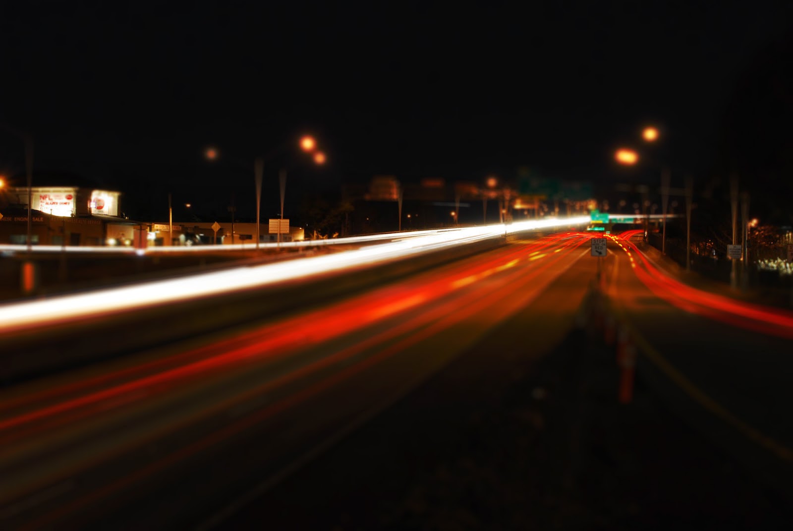
In these photos I played around with shutter speed and exposure to light and color. My dad introduced me to this idea, and I ended up loving the creativity of it. The lines made by the front and tail lights of the cars draw your eyes into the center of the photo by using leading lines. I think that these photos also have a strong relationship by similar colors and simplicity, and tie together the constant use of our roads and transportation methods.
Tuesday, January 24, 2012
Assignment #4: Shape
My three best photos

This photo is radially balanced, and uses geometric shapes. I liked the arrangement of the mirrors, and I think that the contrasting textures and prints adds intrigue to the photo. I also liked the repetition of the subjets, which draws your attention to the shapes in the photo. I chose to make this photo black and white, and I think it gives it a dramatic touch by emphasizing the shadows and reflections.

This photo has a symmetrical balance, and is also organic in shape. My favorite part of this photo is the curving shape to the bar, which I think makes the photo more interesting since it's such an uncommon shape. I also love the simplicity of the picture. Because the bar is the only thing in the frame, all your attention is drawn to the details and wear of the metal.

This photo has a symmetrical balance, and is organic in shape. The thing that stood out the most in this scene is the variety of shapes that make up the dangling branch. I think the idea of complex shapes making up a simplistic one is very interesting and contemporary. The symmetrical balance in this photo continues to add to the simplicity, and draws your attention into the subject.
Subscribe to:
Posts (Atom)